Case Study
Enhancing MedGrocer's User Experience and Brand Consistency
Enhancing MedGrocer's User Experience and Brand Consistency
Evaluated website, planned brand identity, created user-centered design and high-fidelity wireframes using Figma, and made standardized QA checklist using Google Sheets. Awarded the prestigious Kada’s Choice Award for remarkable dedication by the KadaKareer Executive Team.
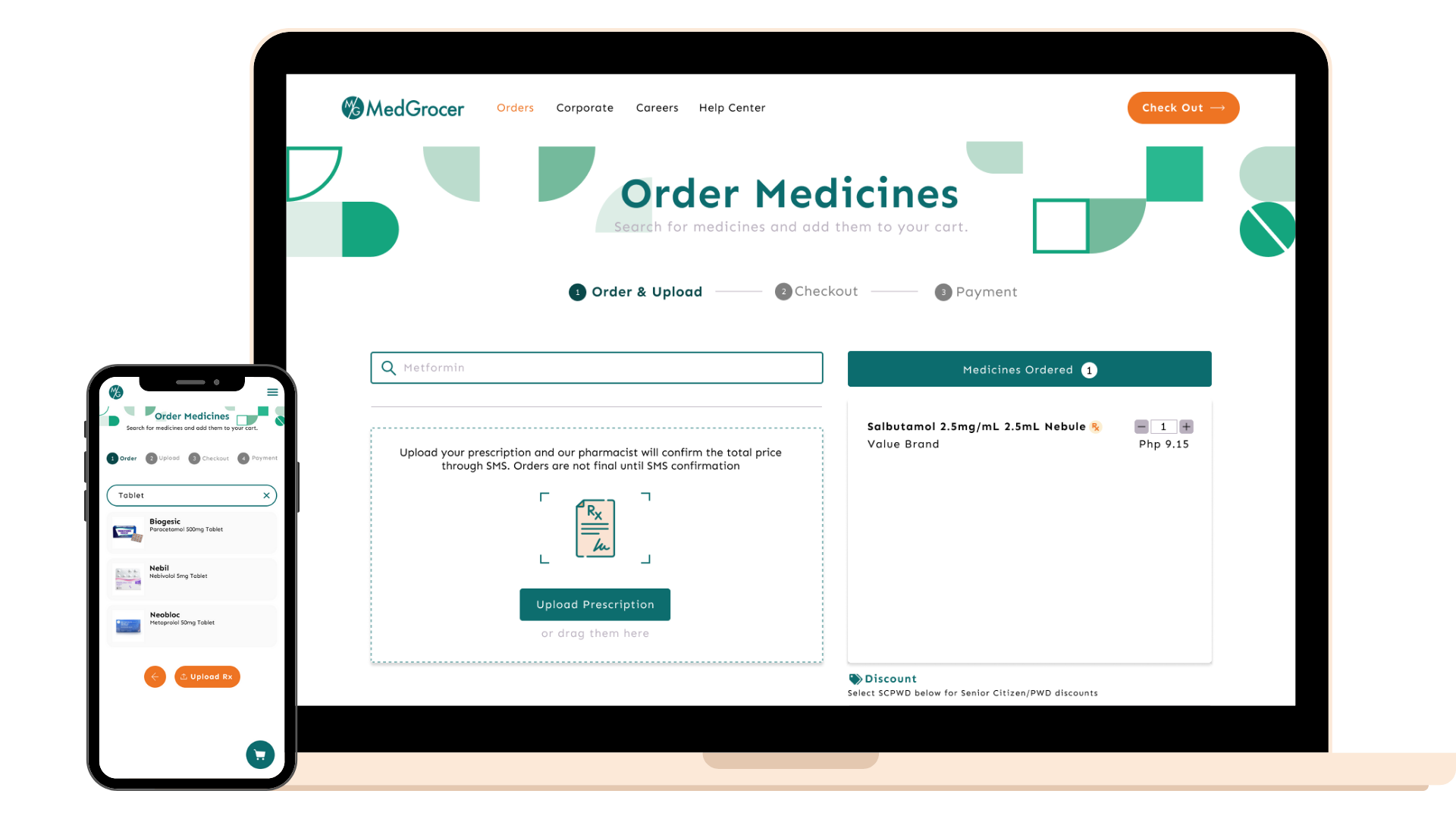
Desktop Prototype Mobile Prototype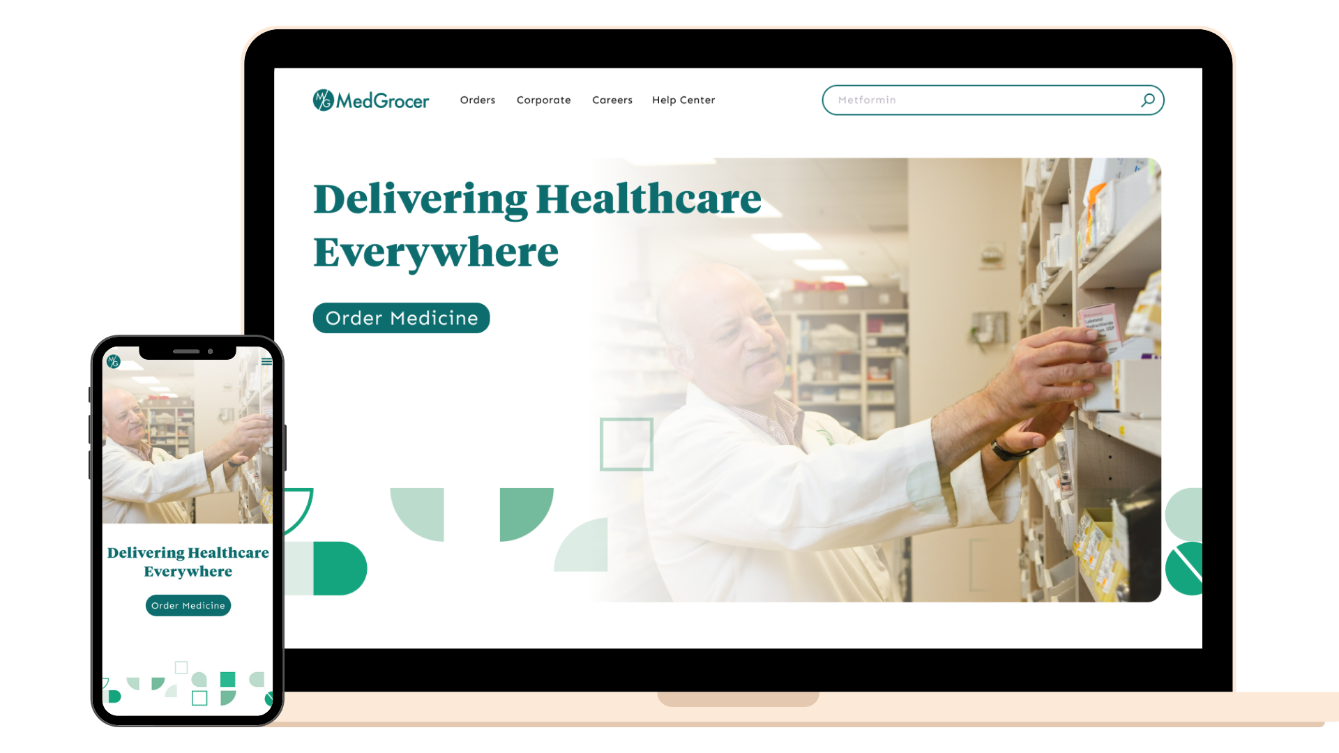
Services
User Interface, User Experience, Quality Assurance, Usability Testing, Web Design, Front-end
Recognition
Kada’s Choice Award by KadaKareer’s Executive Team
Timeline
May - July 2023
Team
3 UI/UX Designers
Technologies
Figma, Google Sheet
Background
About MedGrocer
MedGrocer, a rapidly growing "medicine-as-a-service" company, offers digitally-enabled online pharmacy services, corporate clinics, and patient programs, empowering consumers to conveniently, cost-effectively, and intelligently access their medicines.
Beyond just delivering medicines, MedGrocer also delivers healthcare solutions for corporations: from analytics, to customized programs, to end-to-end fulfillment. They have expanded their services to include:
- Managing clinics by creating schedules and overall management
- Telehealth (online consultation)
- Mental health (online mental health consultation)
MedGrocer's Objective
Multiple iterations of the MedGrocer website have been developed at various times, each one building upon the previous version and introducing upgrades. However, this iterative process has led to inconsistencies in both design and implementation across the different versions. Because of this, MedGrocer wants to unite the look and feel of their platforms under their signature branding which will then lead to a more consistent and easier user experience for their customers. MedGrocer would love to see how their platforms can have a more consistent feel while upholding QA standards and functionality.
Challenges
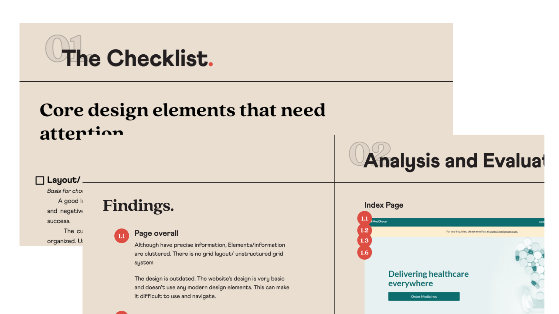
- Conduct thorough research and analysis to identify inconsistencies and discrepancies across the website’s pages.
- Propose a consolidated brand identity for MedGrocer, leveraging the design element checklist and reflecting on the company’s values and appeal to its users.
- Design new wireframes to revamp pages according to the brand guidelines.
- Develop a Figma Library for MedGrocer based on the wireframes designed and the best practices/principles recommended.
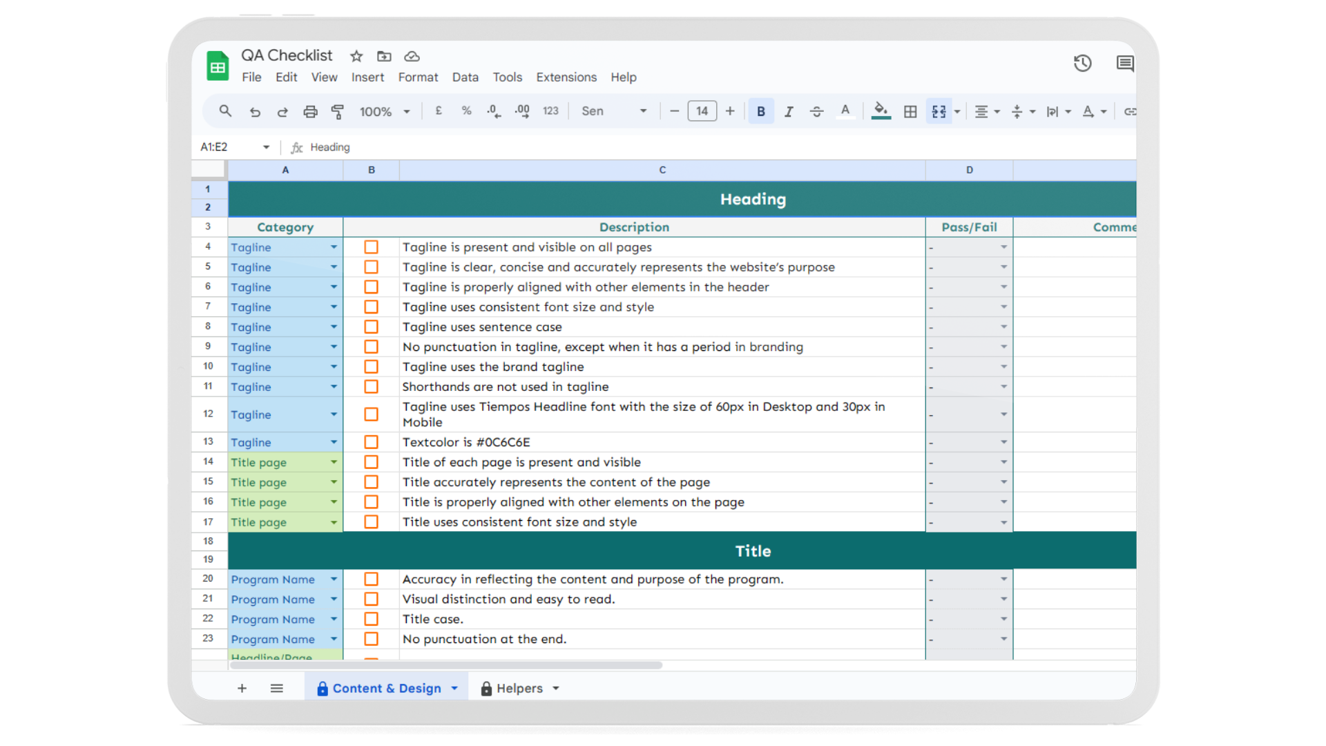
- Create a general and standardized checklist for testing the websites in terms of quality testing.
Value delivered
- Created a more consistent look and feel that united the company’s branding, significantly impacting the experience of its customers.
- Better recognition from customers and better representation of the company’s values and ethos through a standardized look and feel.
- A user-centered design that highlights MedGrocer’s brand identity to users.
- A comprehensive Figma Library that includes all necessary elements for future design work.
- A standardized approach to testing the websites for quality assurance.
Solution delivered
Research and Analysis of MedGrocer's Website
Thorough research and analysis were conducted to improve MedGrocer’s website. Core design elements were identified and the website was explored from a customer’s perspective. The website was evaluated for consistency and insights were provided to create a more consistent look and feel. This improved the experience of MedGrocer’s customers and contributed to the company’s branding and success.
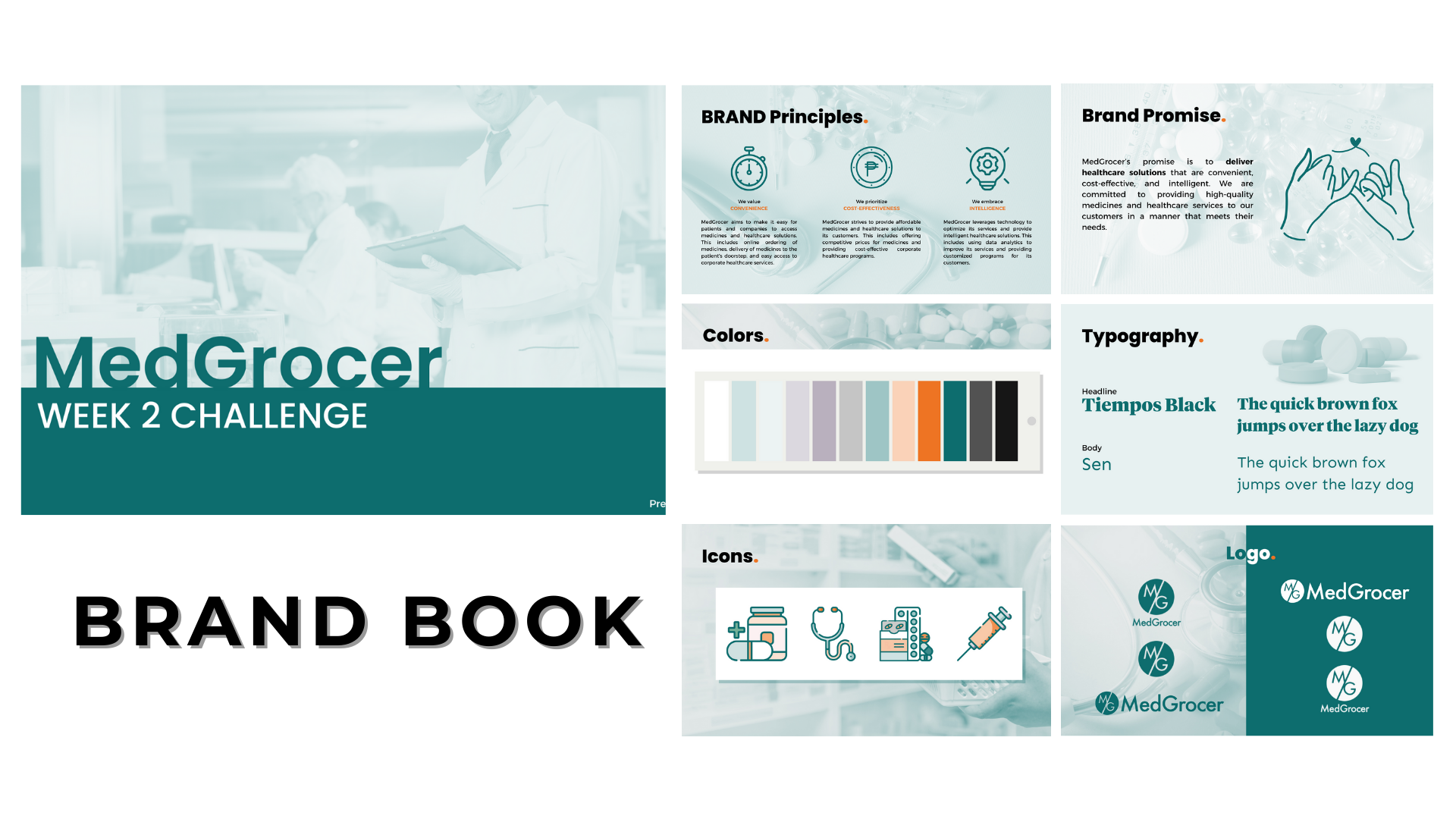
Consolidated brand identity for MedGrocer
A comprehensive guide to maintaining and promoting MedGrocer's brand identity in all external and internal communications. This provides clear and concise instructions on the proper usage of MedGrocer's logo, color palette, tone of voice, and typography. This ensure a consistent and impactful representation of MedGrocer across various websites.
Enhanced UX with revamped mobile and desktop designs
Carefully chosen pages were renovated in alignment with the brand guidelines crafted during the brand identity planning process. A personalized set of recommended design principles was devised to accentuate MedGrocer’s branding across various user-facing pages.
Comprehensive standardized website quality testing checklist
A checklist to ensure that MedGrocer’s website met quality standards. A list of criteria was included that the website had to meet in order to pass the test. This also ensured that the website was of high quality and provided a good experience for users.